

- How To In Magento 2 – How To Start?
- How To In Magento 2 – How To Add Custom Icons?
- How To In Magento 2 – How To Add Modal PopUp?
- How To In Magento 2 – How To Move Checkout Buttons To Order Summary Only On Desktop
- How To In Magento 2 – How To Recognise Shipping And Payment Step In Checkout On Frontend
- How To In Magento 2 – How To Display Shipping Details On Shipping Step In Checkout
- How To In Magento 2 – How To Display Total Price Summary On Shipping Step In Checkout
- How To In Magento 2 – How To Add Tabs (Accordion) Only On Mobile
- How To In Magento 2 – How To Display Additional Text Based On Selected Shipping Methods In The Checkout
- How To In Magento 2 – How To Add Additional Dropdown With Options Based On Selected Shipping Methods In The Checkout
My latest project required the implementation of tabs (accordion) only on mobile view and leave all content as it is on desktop. At the very beginning I thought about using an accordion widget of Magento 2, however I quickly realised it would not work once you resize the browser, which means it will not work on some of the tablets when the vertical screen gets a mobile version and the horizontal screen gets a desktop version. To achieve a nice and smooth effect, I used a collapsible widget of Magento 2.
I am happy to share with you all of the necessary code that you will need to add to your project. I will provide you with an example and I will focus on a case where we want to add tabs (accordion) only on mobile to the content of static page in my Magento 2 project. If you need any help, book with me 1hr Magento 2 Frontend consultation or learn more about starting work with Magento 2!

Contents
How to add tabs (accordion) only on mobile in Magento 2?
Let’s start with the plan of what we need to do in order to add tabs (accordion) only on mobile into our Magento 2 project which you can use for example in the footer as well. As we will focus on the example with the static page, we will have to create a new static page with the content and apply Magento 2 widget. Notice, it can be done on any other elements, as static blocks or phtml templates. You will just need to easily apply a js code on your html structure.
As we will use a collapsible widget, I highly recommend to check Magento 2 Documentation Collapsible Widget. You will be able to find over there all of the options which I will not mention in this blog post.
SUBSCRIBE TO MAGENTO 2 NEWSLETTER!
Would you like to get information when new Magento tutorial is available?
Subscribe to the newsletter and be up to date!
Template
For the needs of this example, I have created a new static page with the content. But again, you can prepare any template and just create a special html structure for it.
<div class="accordion">
    <div class="template">
        <h2 class="heading">Template</h2>
        <p class="content">Information about HTML structuture</p>
    </div>
    <div class="js">
        <h2 class="heading">JavaScript</h2>
        <p class="content">Information about Magento 2 Mixins</p>
    </div>
</div>
Your HTML structure doesn’t need to be exactly as above. The important parts over here are classes and it is good to wrap your code into divs as we will use it later on.
Javascript
We will need to initialise collapsible widget in some way. You can create a specific js file for this action. However, I will add my code to theme.js file as it is a kind of helper for my theme.
theme.js
It is really important to add this file into the correct place. It should be added to vendor/vendor-name/theme-name/Magento_Theme/web/js/, where “vendor-name“ and “theme-name” needs to be replaced with your name of vendor and theme name.
Notice that for the older version of Magento 2, you will have to add the file into vendor/vendor-name/theme-name/web/js/, where “vendor-name“ and “theme-name” needs to be replaced with your name of vendor and theme name.
;define([
    'jquery',
    'collapsible',
    'matchMedia',
    'domReady!',
], function ($) {
    'use strict';

    var helpers = {
        domReady: function() {
            var accordionResize = function($accordions) {
                $accordions.forEach(function(element, index){
                    var $accordion = $(element);
                    mediaCheck({
                        media: '(min-width: 768px)',
                        entry: function() { // desktop
                            $accordion.collapsible('activate');
                            $accordion.collapsible('option', 'collapsible', false);
                        },
                        exit: function() { // mobile
                            $accordion.collapsible('deactivate');
                            $accordion.collapsible('option', 'collapsible', true);
                        }
                    });
                });
            };

            var $container = $('.accordion'),
                $accordions = [],
                accordionOptions = {
                    collapsible: true,
                    header: '.heading',
                    trigger: '',
                    content: '.content',
                    openedState: 'active',
                    animate: false
                };

            $container.children("div").each(function(index, elem){
                var $this = $(elem),
                    $accordion = $this.collapsible(accordionOptions);

                $accordions.push($accordion);
            });

            accordionResize($accordions);
        }
    };

    helpers.domReady();
});
Let’s analyse this code to understand what each part means. I also really often struggle to understand which part of the code or names I can change for my custom ones and which I need to keep as an example, all of it I will try to explain right now.
'jquery',
'collapsible',
'matchMedia',
'domReady!',
We will use collapsible widgets so we need to link it to our file via “collapsible“. To manipulate JavaScript for desktop or mobile view, we will call the mediaCheck() anonymous function from matchMedia.js, in order to link it to our file, we need to add “matchMedia“- read more about this function on Responsive Magento 2 Documentation. Then “domReady!” to apply our code when the website is loaded.
var accordionResize = function($accordions) {
    $accordions.forEach(function(element, index){
        var $accordion = $(element);
        mediaCheck({
            media: '(min-width: 768px)',
            entry: function() { // desktop
                $accordion.collapsible('activate');
                $accordion.collapsible('option', 'collapsible', false);
            },
            exit: function() { // mobile
                $accordion.collapsible('deactivate');
                $accordion.collapsible('option', 'collapsible', true);
            }
        });
    });
};
At this part, we will create the accordionResize function to recognise the resolution and play with our widget. As collapsible widget is initialized for one title/content pair, in the code above we go through all the title/content pair available on our page (available in accordion array). As you can see, our breakpoint for desktop/mobile is 768px.
entry: function() { // desktop
    $accordion.collapsible('activate');
    $accordion.collapsible('option', 'collapsible', false);
},
The code above will be applied when we have desktop view. We use the ‘activate‘ method to expand the content when this method is called. Then we use the ‘collapsible‘ option for the content to be NOT collapsed when the panel is active. After applying the code, the desktop version always has expanded content and the content is never collapsed, which means, the user doesn’t see the tabs (accordion) on desktop view.
exit: function() { // mobile
    $accordion.collapsible('deactivate');
    $accordion.collapsible('option', 'collapsible', true);
}
This part of the code takes care of the mobile version. Over here, we do the opposite. We use ‘deactivate‘ method to collapse the content when this method is called and then we use ‘collapsible‘ option for the content to be collapsed when the panel is active.
var $container = $('.accordion'),
    $accordions = [],
    accordionOptions = {
        collapsible: true,
        header: '.heading',
        trigger: '',
        content: '.content',
        openedState: 'active',
        animate: false
    };
In this part of the code we create a container for our tabs where we reference to ‘.accordion‘ class used in our template. Moreover, we set up options for our widget. Notice, we reference a heading by class ‘.heading‘ and to the content by class ‘.content‘. Of course, you can replace these names to anything you want to, but remember to keep them in the same js file and in the template (HTML structure). At this point, you can play with widget options as per documentation of collapsible widget.
$container.children("div").each(function(index, elem){
    var $this = $(elem),
        $accordion = $this.collapsible(accordionOptions);

    $accordions.push($accordion);
});

accordionResize($accordions);
At this point we will go through our container and look for ‘div‘s inside it to initialise the collapsible widget on each of them. Then we add it (push) to accordions array to be able to run the function on each element that we prepared earlier ‘accordionResize‘.
helpers.domReady();
At the end of the file we have the code above. It is simply to run our function. That’s it!
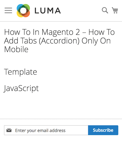
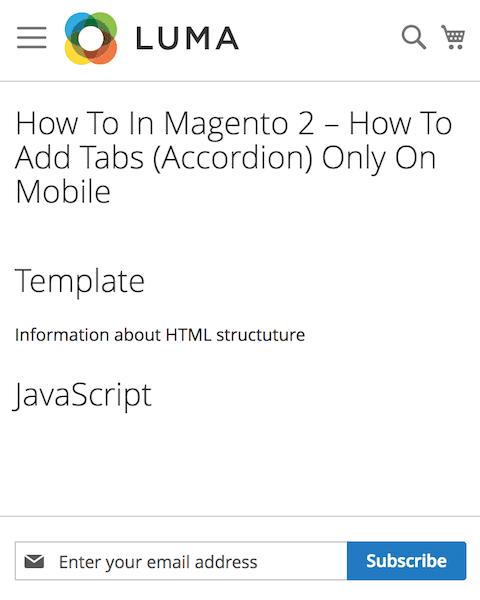
Results
I took for you some screenshots of our implementations based on the Luma theme. I have not added any styling so this is how it will be displayed by default. As you can see, I have added tabs (accordion) only on mobile to the page content on my Magento 2 project.
Desktop
Mobile
MORE MAGENTO 2 TUTORIALS


JOIN THE GROUP ON FACEBOOK!

PIN ME!

I hope it can help with your journey with M2! Also, feel free to give your feedback and advice. In case I made a mistake, let me know! I am only human being 
Did you find this post useful? I would be more than happy if you share it with your friends, maybe someone else will find it useful as well. Good luck!
Editor – Natasha Jay O’Neil, please contact Natasha directly for queries related to her services.
Zaneta loves challenges so deciding about career path she has chosen typical male industry. Woman who codes. Every 1-2 years she lives in different part of the world. Gym dates is something what she specialised in. Healthy lifestyle, extreme sports and motorbikes have stolen her hear years ago.

No Comments
Hi Żaneta,
thank you for the tutorial. It works fine, except when the helpers.domReady() function is executed, the site in the browser scrolls automatically down to the footer. Do you know, how to avoid that?
Fero